
Grafana Cloud: Logs
(4 Pillars of Observability Part #3)
Author: Oscar Moores
Release Date: 13/04/2026

Scalability
Whilst Loki (the log storage solution) does not share much with its namesake, Loki (Norse god of mischief, blood brother of Odin and general prankster) there is one ability they both share. In mythology Loki is known for his ability to shape shift, able to transform into creatures as small as a fish or as great as a bear - something (rather tenuously) Grafana Loki is also able to mimic!
Due to having a distributed architecture Grafana Loki is able to scale incredibly easily, a small setup being suitable for personal projects or testing can shape shift into an enterprise grade log storage set up with ease. And one of the best things about this scalability, it’s not your problem!
Being fully managed in Grafana Cloud all the hassle and worry about scaling is taken out of your hands and handled for you. This means you can spend more time using your logs and less time worrying about how you are going to store them.
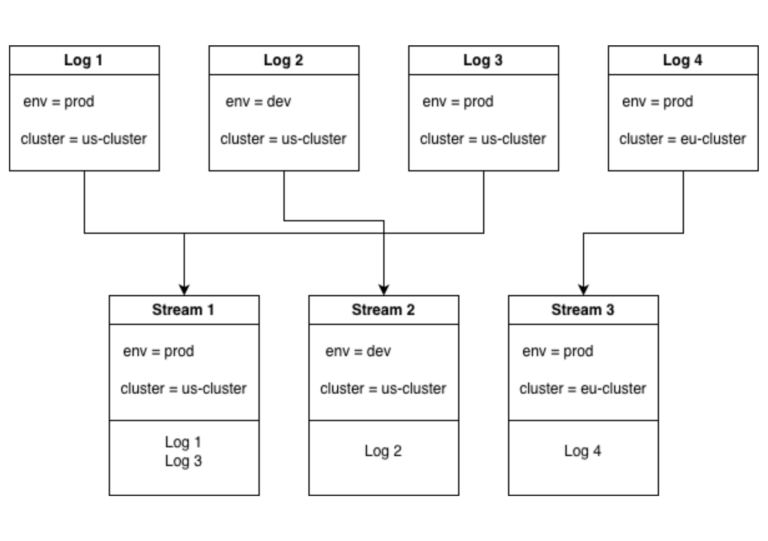
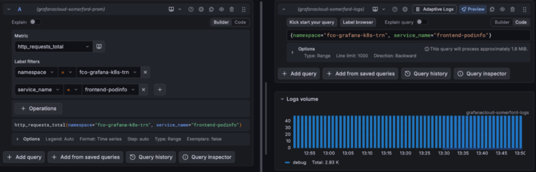
This does come with best practices though, in the example above there are 2 labels with 2 possible values each leaving 4 possible unique combinations of labels. This means there can be up to 4 log streams. If we added a 3rd label with 2 possible values it means there are 8 unique combinations of labels and 8 possible streams. It’s easy to see how the number of log streams could explode if we keep adding labels.
Lets take this to the extreme, what if we added a label with not 2 possible values but 1000s causing the number of streams to increase by a factor of 1000. If we went even further and added another one of these labels we quite quickly go from a number of log streams in the 10s to possible millions of unique label combinations.
This is not a far-fetched proposition either, all you would have to do is add an IP address label and suddenly you have a new stream for every IP in your logs, causing serious performance issues with your Loki.Searching for these high cardinality attributes is still possible though, you just don’t want to add them as labels.
All of this is in line with the way Loki was built, it is partially indexed. It was never intended to index these high cardinality labels, you should narrow down your search using other labels and then when you have a much smaller selection of logs you can then parse these and search based on fields like IP address. What this means in the long run is Loki doesn’t spend time or space on indexing every little label and focuses on ingesting logs at pace - making Loki faster and more efficient if you choose your labels carefully.
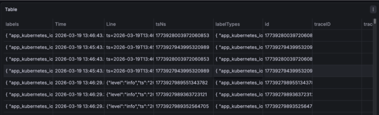
Table
Using the table visualisation you can display your logs in a clean organised format. If you want you can use this in exactly the same way as the logs, just displaying the whole log in the table but you can also use it to display specific fields or calculations based on specific fields. There is also a lot more customisation you can do with the table visualisation.
Each column in a table can have its cells customised. This can be simple, like changing the width or color of a cell or it can be more complex, like turning the cell into a gauge or a link.
Correlating with Logs
In an ideal observability set up you have your 4 pillars of observability: Metrics, Logs, Traces and Profiles. To get the most out of your observability set up you want each of your pillars working together - for example when you find a problem with metrics you want to be able to find the corresponding logs that can help fix your problem.
If you are looking through error logs you might want to jump to related logs to get a big picture understanding of what's going on. This jumping back and forth between telemetry is called “correlating”. There are several ways of going about this correlation business in Grafana ranging from manually looking for related logs/metrics, to data source wide links that take you to related data.
Data Links
Manual correlation is done in the explore menu, great for when you are creating queries to investigate a problem, but often in Grafana you aren't writing your own queries but using a dashboard. This correlation niche is partly filled by data links.
An example scenario where you might use data links. You have a kubernetes monitoring dashboard and a visualisation showing the http error rates by kubernetes pod, you want to find the logs associated with these http errors. You can set up a data link on this visualisation so when you hover over the error rate for a particular pod it will take the labels for this pod and take you to a query or dashboard that is using these labels.
The only downside (depending on how you look at it) with data links is they must be created in advance, so when creating your dashboards you need to anticipate when people might want to jump from one dashboard to another or to a query. Having to create these manually though provides a great tool for curating paths through your dashboard, starting with an overview and letting you get to the more low level dashboards and telemetry whilst narrowing down labels to find the specific data to investigate a problem.
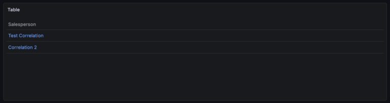
Correlations
Last but very much not least, the correlation feature in Grafana can be used to correlate between entire data sources (shocking). In the correlations menu you create a correlation for a data source, create a query and associate it with a field. Whenever a field with this name is found from its associated data source it becomes a link you can click that runs the query.
An example of when this might be useful. You have a set of logs and in the logs an application name is returned, you can set up a correlation to run a query for metrics related to the application name. As this applies across all dashboards and queries this is much less rigid than data links and quicker than manually moving between your telemetry manually.
Each of these methods of correlating data has its place in Grafana and a good observability set up can take advantage of all 3. Data source wide correlations for data you regularly need to jump between, data links for guiding through a dashboard whilst maintaining context and then for when you have a more niche problem you are troubleshooting manually looking for corresponding telemetry.
How Logs Fit into Grafana and Observability
Logs play an important role in Grafana (as well as observability as a whole), whilst metrics tell you how things are doing, it’s logs that tell you why there is a problem - an essential part of observability.
As an example, you have a set of dashboards to monitor the health of an application. On the dashboard you see a spike in metrics and decide to investigate. You can use a data link on the visualisation to find the logs associated with this metric and investigate to find the cause of the metric spike.
Grafana’s managed Loki datasource means you can ingest as many or as few logs as you need without worrying about how it will scale, all you need to do is make sure your logs haven’t got high cardinality labels (to minimise cost and maximise performance) and the labels they do have are actually useful for troubleshooting.
Then on your dashboards you can create visualisations displaying your logs or you can create queries that aggregate them into metrics and visualise these.
Once your dashboards and queries are created you can jump between your data and streamline investigations through the use of correlations and data links.
In future blogs I will be looking at the last 2 Pillars of Observability: Traces and Profiles then discussing where they fit into Grafana and observability as a whole.